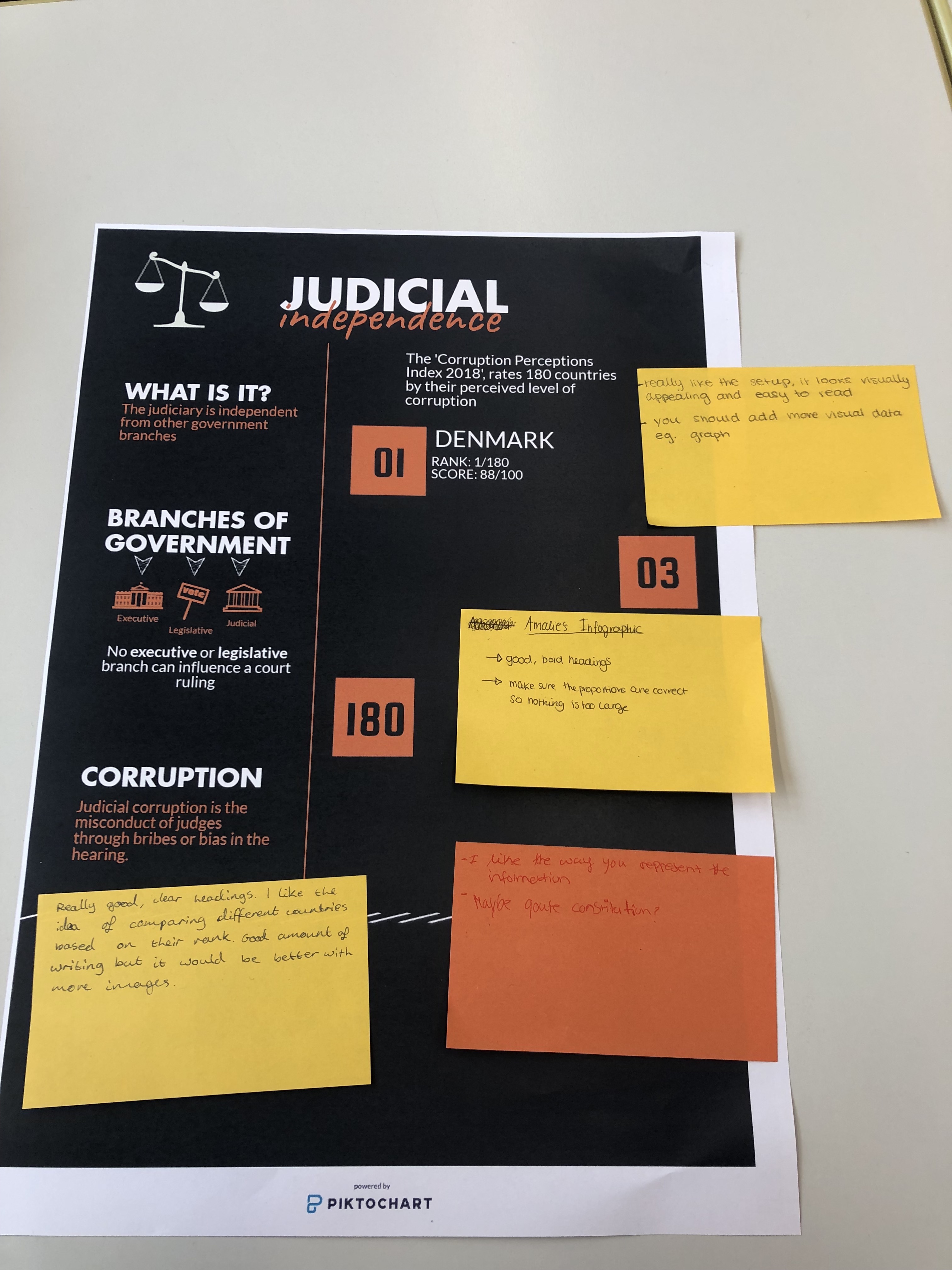
When completing my first draft, I was frustrated about not being able to write long passages of text since I prefer structured writing to a visual display. Being restricted in that way, I felt that my research had to be more concise in order to have a deep understanding to further paraphrase.
I also felt that I spent too much time trying to make it look visually appealing; structuring the page with each necessary sections. This set me back a lot because I ended up having a lot of work to do. My way of solving this issue was to write everything I needed in another document and then copying it over when the structure was done.
My classmates commented on my first draft to give me feedback and things to improve on. Mostly it was positive and a few of the improvements could be sizing, more visual and of course finishing it.
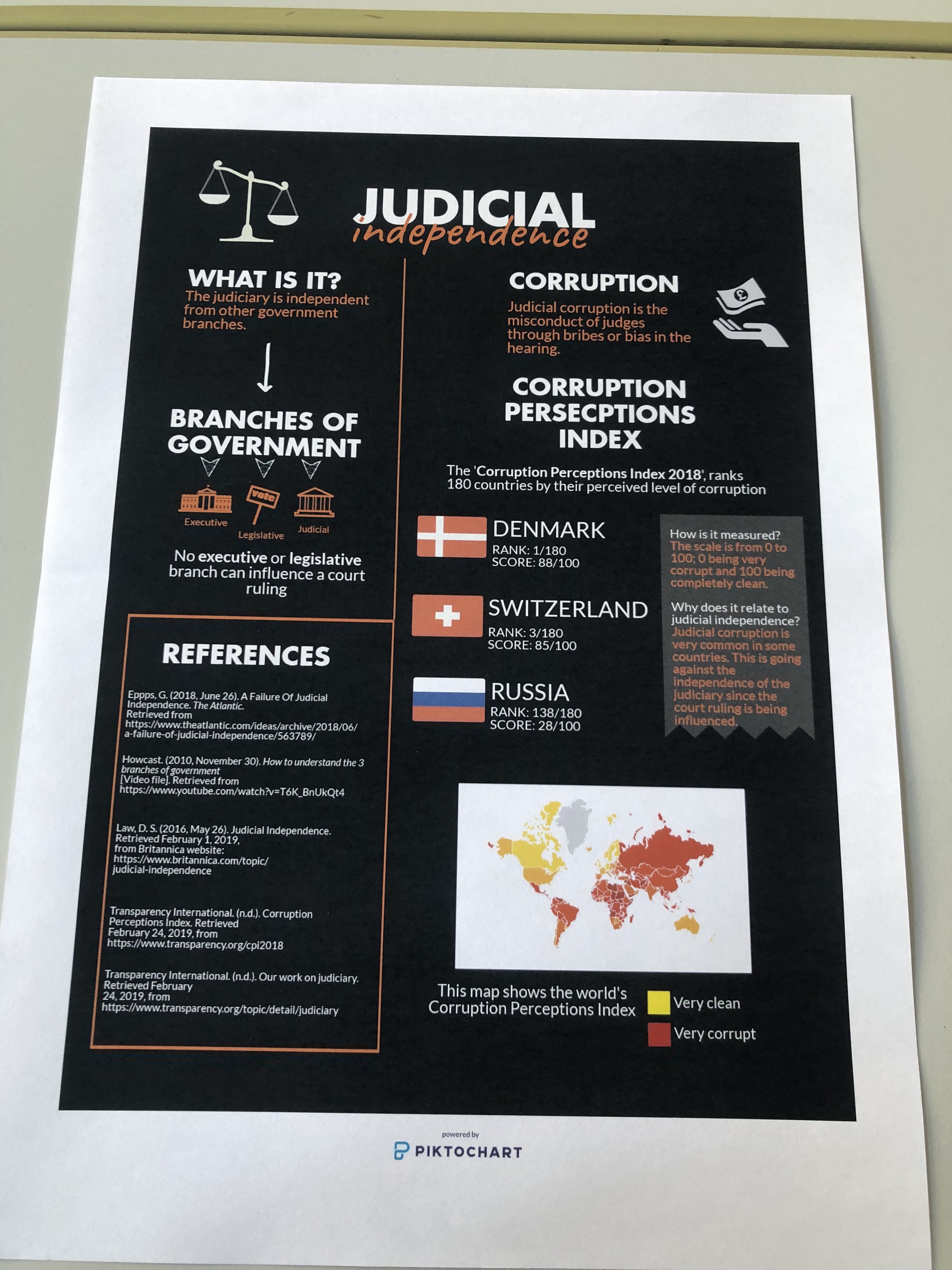
After completing the assignment, I felt I had improved my organisation of the infographic and improved on my classmates comments. My infographic ended up displaying my understanding and research of judiciary independence very well. There are some advantages of showing learning in a visual way because it is simple and explains itself. However, I need to improve a lot on this skill and thereby I find it difficult at the moment.
On my final infographic, I had created an explanation of what judicial independence is in a summary. Then on the right, I used three real world examples of corruption since that is a big aspect of judicial independence. I used various visuals as well as supporting them with small texts. Finally, I included my reference list at the bottom.